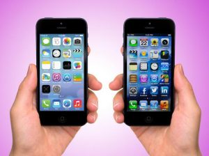
iOS 7, Apple’s latest operating system update, is a great improvement over its previous iterations. The old multitasking bar is now gone and is swapped out for a

control center that gives users quick access to a multitude of settings without going to the settings app. For instance, many people change their brightness settings often, and iOS 7 allows users to do that with a swipe of the screen rather than having to laboriously open the settings app. Another added bonus of iOS 7 is an updated version of Siri. Siri can now search Wikipedia, post to Twitter and Facebook, and (almost) carry a conversation.
iOS 7 is a complete overhaul visually compared to its predecessors. With iOS 7, Apple brings a pop of color to its new operating system. Everything seems more a
bright and colorful compared to its older brothers. The biggest complaint I have with iOS 7 is how the new theme interacts with older app icons. Because iOS 7 comes with updated default app icons that are plain compared to older ones, the older apps look bulky compared to those of iOS 7.
I strongly disagree with those that claim iOS 7 looks similar to the Android operating system. It’s still the same iPhone we know and love. Overall, I would say that iOS 7 is definitely a step up compared to its brothers and has a lot of potential. I can’t wait to see the future iterations of it and the changes they bring.


